Best Tips for Designing Effective Inlay Cards?
Designing an effective inlay card is essential for any product. According to industry expert Sarah Jenkins, "An inlay card should not just communicate; it needs to connect." This emphasizes the importance of thoughtful design in creating a memorable user experience.
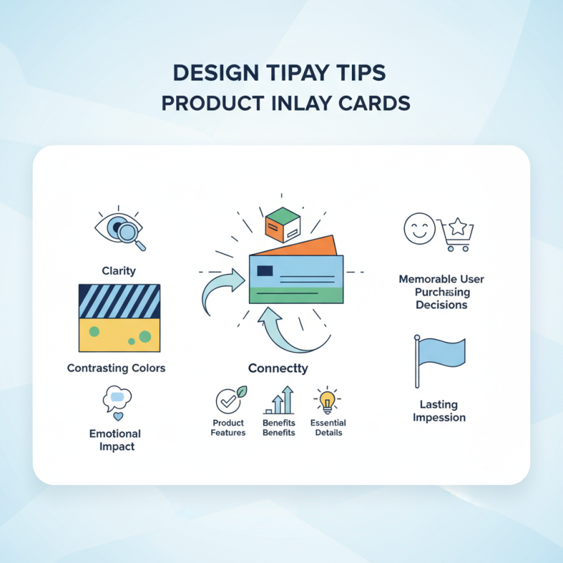
When designing an inlay card, clarity is crucial. The information should be legible and visually appealing. Use contrasting colors but avoid overwhelming designs. A cluttered card can confuse consumers. Focus on essential details like product features and benefits.
Additionally, consider the emotional impact of the design. An inlay card should resonate with the target audience. Simple graphics can enhance the message without distractions. Reflect on your approach and ask, does the design truly represent the product's essence? Effective inlay cards go beyond mere functionality; they create a lasting impression that influences purchasing decisions.
Understanding the Purpose of Inlay Cards in Product Packaging
Inlay cards play a crucial role in product packaging. They enhance the unboxing experience. These cards carry important information. This can include product details, instructions, and branding elements. A well-designed inlay card can communicate the value of your product effectively. It should attract attention while remaining functional.
Understanding the purpose of inlay cards is essential. They provide an opportunity to connect with consumers. The design must be clear and appealing. Use vibrant colors and readable text. However, don't overcrowd the card with information. Too much text can overwhelm the reader. Aim for simplicity, but don’t neglect creativity.
Consider the size and material of the card as well. It needs to fit perfectly within the packaging. Think about the paper quality too; it should feel premium to the touch. Every detail matters in creating a lasting impression. Ultimately, inlay cards should enhance the product’s overall appeal. They should inform and entice, but also reflect on what truly represents your brand.
Key Elements of Effective Inlay Card Design
Effective inlay card design hinges on a few critical elements. First, clarity is key. Using legible fonts and well-structured content helps convey your message effectively. Consider that about 70% of consumers prefer clear information over complicated text, according to industry reports. Visual hierarchy matters too. Important information should stand out through varying font sizes or bold styles. This guides the reader's eye naturally.
Tip: Use high-quality images relevant to your content. Research shows that visuals can increase engagement by up to 94%. Avoid clutter, though. An overloaded design can confuse your audience. Ensure plenty of white space surrounds your text and images. Less is often more when it comes to inlay cards.
Another vital aspect is the color palette. Choose colors that represent your brand but also ensure readability. Harmful color combinations can deter readers. For example, red text on a green background can be difficult to read. Reflect on your choices. When designing, ask yourself if each element serves a purpose. This self-check can refine your design. Effective inlay cards can significantly impact consumer perception; don't underestimate their potential.
Best Tips for Designing Effective Inlay Cards
| Key Element | Description | Example Usage |
| Visual Hierarchy | Organizing information in a way that prioritizes important elements to draw attention. | Using larger fonts for titles and smaller ones for descriptions. |
| Color Scheme | Selecting colors that complement each other while enhancing readability and branding. | Using primary brand colors for accents and neutral tones for backgrounds. |
| Font Choice | Choosing fonts that are legible and fit the tone of the content. | Applying serif fonts for traditional themes and sans-serif for modern looks. |
| Imagery | Incorporating relevant images or graphics that enhance the message of the card. | Utilizing high-quality photos that relate directly to the content. |
| Content Clarity | Ensuring that the text is concise and to the point without unnecessary jargon. | Using bullet points for easy scanning of key information. |
| Call to Action | Including a clear and compelling call to action that guides the reader on the next steps. | Phrasing like "Visit us today!" or "Get started!" prominently displayed. |
Utilizing Typography to Enhance Readability and Appeal
When designing inlay cards, typography plays a crucial role. A well-chosen font can significantly enhance readability and visual appeal. According to a report from the American Institute of Graphic Arts, 67% of consumers prioritize good typography when judging product packaging. This highlights the need for clear and engaging text.
Selecting the right typeface is just the start. It's important to consider font size and spacing. Text that is too small is often overlooked. Ideally, the main content should be at least 12 points. Tracking and leading are vital for readability. Poorly spaced text can create frustration. Industry standards suggest a minimum of 1.2x the font size for line spacing, allowing the eye to move comfortably across the lines.
Color contrast also matters. Research indicates that high contrast improves legibility. However, using too many colors can be overwhelming. Maintain simplicity and coherence in design. Feel free to experiment, but remember that balance is key. Too many stylistic choices may lead to confusion. Reflect on the overall design and seek feedback. Great typography is not just about aesthetics; it should connect with the audience.
Incorporating Visuals: Colors and Images for Brand Identity
Incorporating visuals into inlay card design is crucial for brand identity. Research from the Graphic Design Association shows that colors can increase brand recognition by up to 80%. This elevation in visibility stems from emotional connections to color. For example, warm colors like red and yellow evoke energy, while blues often imply trust.
Images play an equally vital role. They communicate messages quickly. A captivating image can say more than words ever could. A study by the Visual Marketing Alliance indicates that visuals can increase engagement rates by 94%. Elements such as high-quality graphics and brand-related visuals create a cohesive look. Yet, it’s essential to strike a balance. Overly complex designs can detract from the core message.
In the fast-paced world of marketing, simplicity is key. Too much information can overwhelm consumers. A clear and focused design is often more effective than a crowded one. Reflecting on past designs can help improve future efforts. Learning from what worked and what didn’t is vital for growth. Remember, the aim is to create a lasting impression that aligns with your overall brand strategy.
Best Practices for Material Selection and Sustainability in Inlay Cards
When designing inlay cards, material selection plays a crucial role in sustainability. Eco-friendly materials are gaining traction in the industry. According to a recent report by Smithers Pira, the market for sustainable packaging is expected to reach $500 billion by 2025. This shift is driven by consumer demand for greener products.
Recycled paper and biodegradable plastics are popular choices. These options not only reduce environmental impact but also appeal to eco-conscious customers. However, it's important to ensure these materials don't compromise print quality. For instance, using post-consumer recycled (PCR) paper can be an effective choice, but the texture may not always match that of virgin paper. Balancing quality with sustainability requires careful consideration.
Innovative materials like plant-based inks and compostable laminations are also emerging trends. These advancements can enhance sustainability but may come with higher production costs. Brands often face challenges in sourcing reliable suppliers for these materials. They must reflect on whether higher costs align with their brand ethics and consumer expectations. The evolving landscape calls for constant learning and adaptation in the design process.
Best Tips for Designing Effective Inlay Cards
This chart illustrates the importance levels of various factors to consider when designing effective inlay cards. Each factor is rated on a scale from 1 to 10, highlighting areas of focus for material selection and sustainability.